BORN GREEN
Born Green is a company that specialises in manufacturing high-end children's clothing for newborns to 12 years old, made solely from sustainable materials. The company was created in 2004, and the client wanted to overhaul it. They also wanted to relaunch the brand, expand their merchandise range, and update their online shopping and delivery features. My tasks were to redesign the logo and create a design for a mailer box, including the box, tissue paper, and thank-you card.
The customer requested that one of the elements from the existing logo be retained. The best part was the colour, so I used it in the new design. I also included the company's name, which was the second requirement.
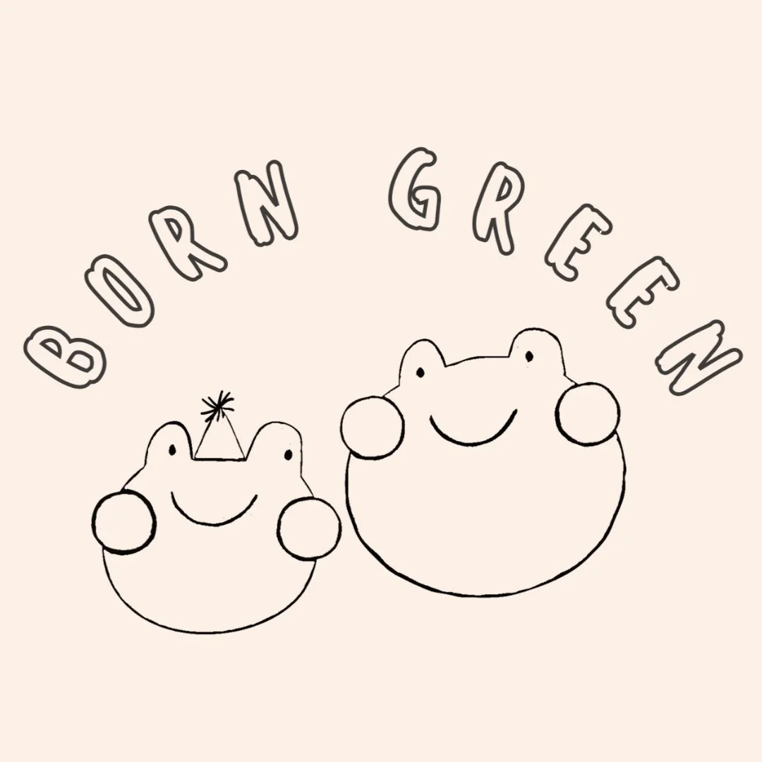
I decided to go with this particular image because it aligns well with the brand's name, BORN GREEN, as the frogs are, in fact, born green. It makes it more memorable.
Looking at it invokes feelings of safety, happiness and comfort. This logo is perfect for all the documents, marketing materials, merchandising and internet presence. It is memorable, stands out from the competition, and brings pleasant associations when you look at it.


Old logo
New logo
I also created an alternate yet coherent colour scheme for the logo. This specific design makes it challenging to develop a good-looking but distinct colour palette. I decided to go with a simple black-and-white outline. Uneven lines create the effect of a picture hand-drawn by a child, which lends the brand more authenticity, aligns with the company's general vibe, and captures the potential customer's attention. It looks great on clothing. Used on the label is easy to remember. The design used on the clothes is unobtrusive and consistent with other pieces in the product line.

Alternate logo version
A 3D mock-up of the box with different views makes it easier to imagine the final product's appearance. I chose the sticker rather than the branded tape or imprinted logo. I consider it the most eco-friendly solution and, simultaneously, the most aligned with the brand’s identity.
Inside the box, on the lid, I placed the company’s name and website address to make it easier for customers to remember.
I decided to go with plain green tissue paper. I chose a brighter shade of green because it seems more cheerful and childlike. As a finishing touch, I added a little sticker with a logo.
It provides an additional opportunity for clients to see and remember the logo. It also has a practical application. It holds a tissue paper together.
I used a comic speech bubble in the 'Thank you' card to make it more interesting and attract the client's attention. It is helpful to include links to all social media platforms and ask for feedback. The second side of this note has space for a handwritten 'Thank you' to the customer. It has a personal touch, creating a bond between the customer and the brand, which every brand should strive for.

